Example: Line Chart Over Years
Contents
# Start (as usual) by loading libraries
import numpy as np
import pandas as pd
import matplotlib as mplib
import matplotlib.pyplot as plt
import seaborn as sns
Example: Line Chart Over Years#
In this last section, we’ll look at a line chart while incorporating all the other methods we’ve gone over in this notebook. Here, we want to look at the change in number of jobs by year, separating them into each age group so that we can look at the trends for each age group as well as compare the trends across age groups.
In order to do this, we’ll need to get that data from multiple Data Frames, since we want to combine data from multiple years. We’ll put them all in lists, then bring it all together into one Data Frame, setting the index of that Data Frame to the correct year, then plot the line chart. Since we want to separate it by age group
Recall that we’ve already brought in data from 2009 to 2015 previously. We’ll use that data for now, replicating that code here. You can try changing the values to add more years, or use a different state. We’ll show all of the code, then go over the individual parts.
def get_wac(year, state = "ca"):
    '''
    Gets the WAC data for a given state and year.
    ---
    state: string, two-letter code of state for which we want the data
    year: int, the year we want to bring in data for
    '''

    base_url = 'https://lehd.ces.census.gov/data/lodes/LODES7/'
    file_specs = f'{state}/wac/{state}_wac_S000_JT00_{year}.csv.gz'
    file_name = base_url + file_specs

    # print("The URL for the file is at: " + file_name)
    output = pd.read_csv(file_name,compression='gzip')
    return(output)
# Initialize an empty dictionary.
wac_all_years = {}

# This loop might take a little bit of time.
# If you want to see progress while it runs, uncomment the second line in the loop.
for i in range(2009,2016):
    wac_all_years[i] = get_wac(year = i)
    # print("WAC for " + str(i) + " obtained.")
# Initialize the lists we'll use to create Data Frame
ca_c000 = []
ca_ca01 = []
ca_ca02 = []
ca_ca03 = []

# Loop through all years and get total jobs by age group
for i in range(2009,2016):
    tempdf = wac_all_years[i]
    ca_c000.append(tempdf.C000.sum())
    ca_ca01.append(tempdf.CA01.sum())
    ca_ca02.append(tempdf.CA02.sum())
    ca_ca03.append(tempdf.CA03.sum())

# Create the overall Data Frame
plot_df = pd.DataFrame({"C000": ca_c000, "CA01": ca_ca01,
                       "CA02": ca_ca02, "CA03": ca_ca03},
                       index=range(2009,2016))

# Now to plot
fig, ax = plt.subplots(figsize=(8,6))

# Add each plot
plot_df.C000.plot(kind='line', ax=ax, legend=True)
plot_df.CA01.plot(kind='line', ax=ax, legend=True)
plot_df.CA02.plot(kind='line', ax=ax, legend=True)
plot_df.CA03.plot(kind='line', ax=ax, legend=True)

# Just to make x-axis look nice
ax.get_xaxis().get_major_formatter().set_useOffset(False)
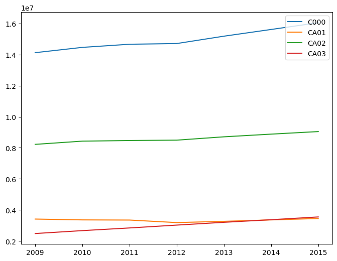
We start by initializing four lists. These are the lists in which we’ll store the total number of jobs for each age group by year.
ca_c000 = []
ca_ca01 = []
ca_ca02 = []
ca_ca03 = []
The lists each correspond to an age group (or the total of all age groups), so we’ll plot lines for four different categories: Total, 29 or younger, 30 to 54, and 55 or older. Next, we go through the loop.
for i in range(2009,2016):
    tempdf = wac_all_years[i]
    ca_c000.append(tempdf.C000.sum())
    ca_ca01.append(tempdf.CA01.sum())
    ca_ca02.append(tempdf.CA02.sum())
    ca_ca03.append(tempdf.CA03.sum())
We’re going to be looping through each year from 2009 to 2015. In each iteration, we start by storing the Data Frame for that year in tempdf. This step isn’t absolutely necessary, as we could have chosen to replace each instance of “tempdf” with “wac_all_years[i]” in the rest of the loop, but I’ve done it to make the code more readable. Next, for each of the four categories, we’ll take the appropriate column, calculate the sum, then append it to the appropriate list. This all takes place in one line for each category.
plot_df = pd.DataFrame({"C000": ca_c000, "CA01": ca_ca01,
                       "CA02": ca_ca02, "CA03": ca_ca03},
                       index=range(2009,2016))
We then create a new Data Frame called plot_df that has a column for each age group and a row for each year. Notice that we create a dictionary with column names as keys and the lists containing the elements as the values. In addition, we specify the index to be the years. You can check the contents of plot_df to get a better idea of what we’ve constructed.
plot_df
| C000 | CA01 | CA02 | CA03 | |
|---|---|---|---|---|
| 2009 | 14122178 | 3415234 | 8222618 | 2484326 |
| 2010 | 14462669 | 3361853 | 8429360 | 2671456 |
| 2011 | 14664138 | 3351381 | 8469390 | 2843367 |
| 2012 | 14709292 | 3189236 | 8493125 | 3026931 |
| 2013 | 15182968 | 3268571 | 8707699 | 3206698 |
| 2014 | 15614666 | 3361131 | 8880201 | 3373334 |
| 2015 | 16048747 | 3451786 | 9045644 | 3551317 |
Lastly, we plot the figure using similar methods as before, except with kind='line'.
fig, ax = plt.subplots(figsize=(8,6))

plot_df.C000.plot(kind='line', ax=ax, legend=True)
plot_df.CA01.plot(kind='line', ax=ax, legend=True)
plot_df.CA02.plot(kind='line', ax=ax, legend=True)
plot_df.CA03.plot(kind='line', ax=ax, legend=True)

ax.get_xaxis().get_major_formatter().set_useOffset(False)
The last line is simply to make the years look nicer on the x-axis. You can try plotting without the last line (i.e. comment it out) to see what happens without it.
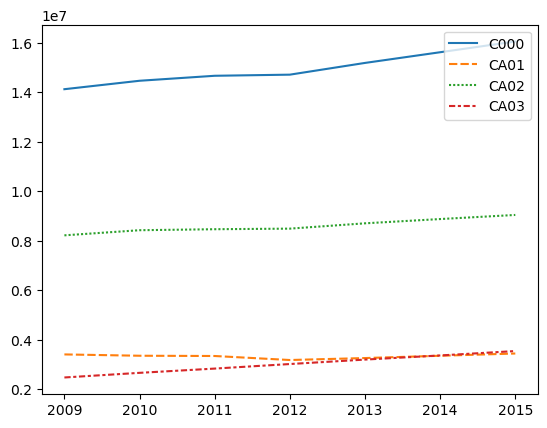
Using Seaborn#
To obtain the above graph, you can actually use the seaborn function lineplot with the plot_df DataFrame to get the same thing.
sns.lineplot(data=plot_df)
<Axes: >
Saving Figures#
Of course, some of the figures we make might help us visualize when exploring the data, but we might also want to save them to include in presentations or to show others without needing to run code. We can save the figure by using the savefig() method. Notice that we include the “.png” file extension in the name of the file. Here, we also specify a dpi.
fig.savefig('jobsbyage.png', dpi=600)
In order to save a seaborn plot, you can use the same savefig method, but you need to first extract the Figure object.
g = sns.lineplot(data=plot_df)
f = g.get_figure()
f.savefig('sns_jobsbyage.png')

Checkpoint: Visualize Your Data#
Try using the methods we’ve described above, try visualizing your data set. What do the visualizations tell you? How are they different from the data from California? How are they the same? Does this make sense?