Other Plotting Libraries
Contents
# Start (as usual) by loading libraries
import numpy as np
import pandas as pd
import matplotlib as mplib
import matplotlib.pyplot as plt

df_2015 = pd.read_csv('https://lehd.ces.census.gov/data/lodes/LODES7/md/wac/md_wac_S000_JT00_2015.csv.gz', compression = 'gzip')
Other Plotting Libraries#
While matplotlib can be very useful for creating graphs, it can be easy to get bogged down in all of the intricacies of customizing everything you want to do. In this section, we introduce a few other plotting libraries that you can use to make graphs. We only show a few examples of doing simple histograms and boxplots here, because there are lots and lots of possibilities for visualizations, so we don’t want to spend too much time on going every single little detail here. Instead, these are meant to show a little bit about the syntax and style of the graphs that are produced so that you can learn more about them on your own if you’d like.
Seaborn#
Seaborn is a package built on top of matplotlib that is meant to make some of the difficult tasks easier to do. We first import it then set the style. We are using the default style for Seaborn here.
import seaborn as sns

sns.set_style()
A basic histogram can be made using the sns.displot function, passing the Data Frame as the first argument, then specifying the x variable and any other arguments to adjust the plot as necessary.
sns.displot(df_2015, x = 'CA01', stat="density", discrete=True)
<seaborn.axisgrid.FacetGrid at 0x1117a1a90>
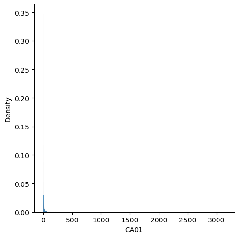
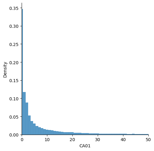
This doesn’t look very nice because it’s trying to plot every single value, and there are some big outliers. Let’s limit to a small area.
sns.displot(df_2015, x = 'CA01', stat="density", discrete=True).set(xlim=(0,50))
<seaborn.axisgrid.FacetGrid at 0x1348058b0>
ggplot#
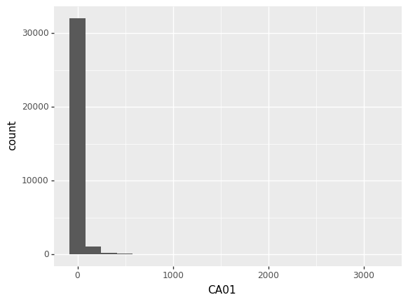
For people familiar with R and ggplot2, using ggplot might be preferable because it uses a lot of the same syntax as the R version. The ggplot visualizations use the grammar of graphics to build a plot, meaning it requires defining the dataset, the aesthetics of the plot, as well as the geometric objects to use to build the plot. For example, to create a histogram, we would need to specify the Data Frame we are using with ggplot, add on the aesthetics using aes, then use the appropriate geom_histogram to add the histogram geometric object on top of that.
from plotnine import *
ggplot(df_2015) + aes(x = 'CA01') + geom_histogram(bins = 20)
<ggplot: (340027450)>
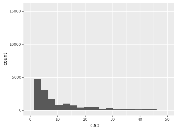
Again, this is hard to read, so let’s try limiting the x-axis.
ggplot(df_2015) + aes(x = 'CA01') + geom_histogram(bins = 20) + xlim(0,50)
/Users/bkim/mambaforge/envs/myenv_x86/lib/python3.9/site-packages/plotnine/layer.py:333: PlotnineWarning: stat_bin : Removed 2434 rows containing non-finite values.
/Users/bkim/mambaforge/envs/myenv_x86/lib/python3.9/site-packages/plotnine/layer.py:411: PlotnineWarning: geom_histogram : Removed 2 rows containing missing values.
<ggplot: (340097455)>
Boxplots can be done similarly except you need supply a “dummy” input for the x value if you want to create a boxplot of just one variable.
ggplot(df_2015) + aes(x= 0, y = 'CA01') + geom_boxplot() + ylim(0,50)
/Users/bkim/mambaforge/envs/myenv_x86/lib/python3.9/site-packages/plotnine/layer.py:333: PlotnineWarning: stat_boxplot : Removed 2434 rows containing non-finite values.

<ggplot: (340140710)>
Checkpoint: Using Other Packages#
Try using the methods we’ve described above, try visualizing your state again. Look at the documentation and see if you can figure out how to do different types of graphs as well.